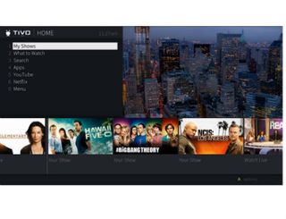
TiVo Nearing Wider Deployment of ‘Project Hydra’ UI

If a move toward field trials offers any indication, TiVo appears to be inching toward the wider rollout of a new user interface code-named “Project Hydra.”
Margaret Schmidt, TiVo’s chief design officer and vice president of product development, recently tweeted that the company was seeking people to try it out, directing them to a web page with more detail about the field trial and a way for consumers to sign up for it.
If you haven't owned/used @TiVo in the last 10 years, we'd love your help testing something new: https://t.co/XwHGYAGMzT
— TiVo Margret Schmidt (@tivodesign) June 6, 2017
A TiVo official confirmed that this is for a beta trial of the Project Hydra user interface. Vodafone España was the first operator partner of TiVo’s to deploy the interface for a new 4K-compatible set-top box.
TiVo has not announced a date for the wider launch and expanded availability of the new UI, but the beta test site notes that TiVo is targeting a new software release for “late 2017.”
Update:Gadget blogger Dave Zatz points out that the release timing is far behind the original schedule:
Late 2017 only puts it one year behind schedule. ;) https://t.co/Yt6L3agCG8
— Dave Zatz (@davezatz) June 9, 2017
TiVo presented some details on its redesigned and streamlined interface in February, noting that operators will have the ability to customize it with their branding and through the use of different colors. It will offer a more unified look and feel across different devices.
This video overview from Schmidt explores some of the features, noting that operators can customize the menus, and that a new strip along the bottom of the UI presents recommended programming that’s based on viewing behavior by time of day and the day of the week.
Also included is something Schmidt refers to as a “trade-up experience” in which the viewer can use the arrow keys to drill down into content. Clicking right shows what programming the other tuners on the box is pulling in, left pulls up the user’s favorite channels, down presents the prediction strip, and up offers a presentation of what’s on different channels, including what’s on now and what’s coming next.
The new UI also borrows a page from TV’s past with support for a standard grid guide, an option that Sling TV recently added to its interface.
Multichannel Newsletter
The smarter way to stay on top of the multichannel video marketplace. Sign up below.
